2016
Digital ordering journey:
Redesigning a cross-cultural retail experience

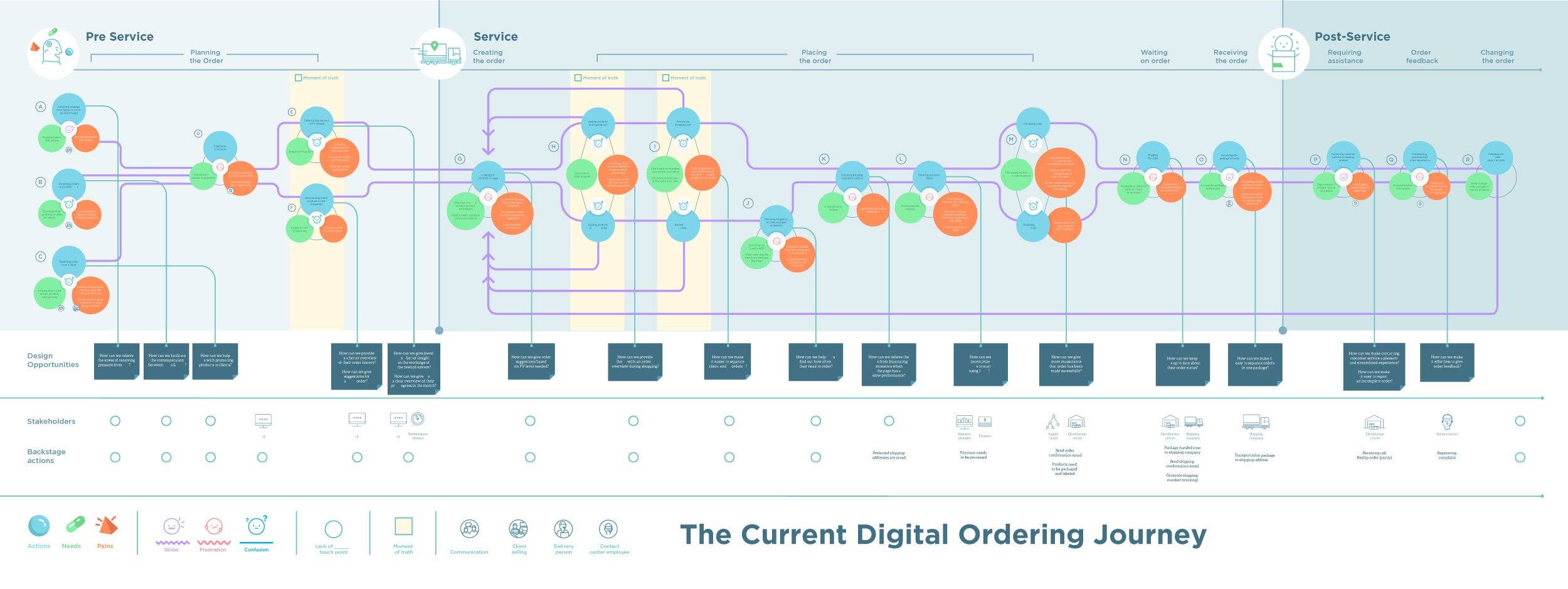
A glance at the entire current customer journey elaborated in the project
For a large international consumer goods manufacturer based in the US (in top 50 largest private companies in the US), I worked on analysing and redesigning the service experience of their customers when ordering products from their website.
When faced with an increasing number of customers purchasing through their online portal instead of physical stores, the client was motivated to rethink the online ordering process they offer and bring it more into line with the experiences people were desiring when buying things online. A more positive customer experience during all different parts of the purchasing process would allow for a more satisfying and stress-free journey and most likely result in an increase of online sales.
When faced with an increasing number of customers purchasing through their online portal instead of physical stores, the client was motivated to rethink the online ordering process they offer and bring it more into line with the experiences people were desiring when buying things online. A more positive customer experience during all different parts of the purchasing process would allow for a more satisfying and stress-free journey and most likely result in an increase of online sales.
An additional focus for the project was the need to understand cultural differences across markets (the US and Latin America) as well as the difference in purchasing experience for customers that visit the client’s physical stores or their online store.
The outcomes of the project helped gain the client deep insights into their customers’ expectations, emotions and barriers experienced during product ordering, and provided them with a first iteration of those insights translated into a redesigned User Experience flow.
The outcomes of the project helped gain the client deep insights into their customers’ expectations, emotions and barriers experienced during product ordering, and provided them with a first iteration of those insights translated into a redesigned User Experience flow.

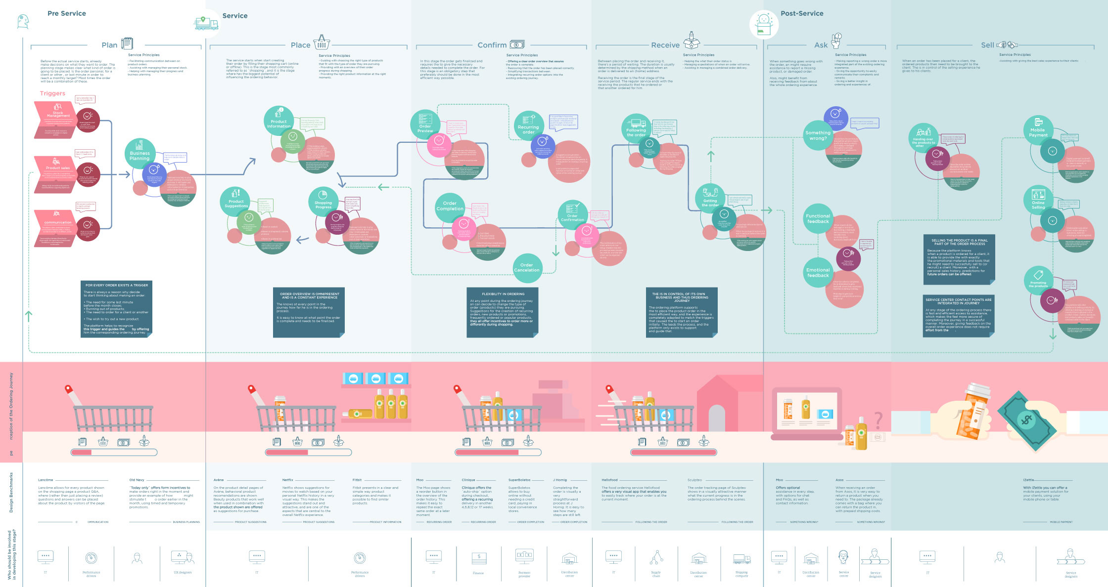
A preview of the final result: a service blueprint for an ‘ideal’ ordering journey
The design problem
The client was looking to offer their customers a purchasing experience that was up to date with existing retail ecommerce as well purchasing experiences in other industries, that customers are growing more and more accustomed to when shopping online. Additionally they aim to offer an experience that clearly stands out as easy to use and innovative when compared to their direct competitors.
And there were a number of additional challenges found when analysing the customer’s current journey, some examples of these are:
And many more, most of which have been addressed by translating them to design opportunities.
Users of the product
Regular customers that order consumer goods online through the client’s North American and Latin American websites. As an added complexity, some of these regular customers would also visit the client’s physical stores in addition to their online purchasing.
User research
Qualitative research: in person as well as remote interviews in different market places - across the US as well as across Mexico. Walk along sessions in client’s physical stores with a selection of customers in Mexico.
Design process
The project was executed in four sequential phases:
The client was looking to offer their customers a purchasing experience that was up to date with existing retail ecommerce as well purchasing experiences in other industries, that customers are growing more and more accustomed to when shopping online. Additionally they aim to offer an experience that clearly stands out as easy to use and innovative when compared to their direct competitors.
And there were a number of additional challenges found when analysing the customer’s current journey, some examples of these are:
- Cultural differences: as an international client, both the offering and expectations of customers differs across different markets globally. In this project I focused on understanding those differences between the ordering journey in the US as well as in the Latin American market.
- Customers possibly encounter distinct sources of stress or confusion before even starting their digital ordering journey online; e.g., the realisation they ran out of a certain product, planning of recurring orders (knowing when to order which product) or even having to communicate with others if placing an order for them.
- The customer feeling unsure about whether their order has been successfully placed, e.g., a lack of direct feedback in relation to the confirmation of their order(s).
And many more, most of which have been addressed by translating them to design opportunities.
Users of the product
Regular customers that order consumer goods online through the client’s North American and Latin American websites. As an added complexity, some of these regular customers would also visit the client’s physical stores in addition to their online purchasing.
User research
Qualitative research: in person as well as remote interviews in different market places - across the US as well as across Mexico. Walk along sessions in client’s physical stores with a selection of customers in Mexico.
Design process
The project was executed in four sequential phases:
- 1) user research in different streams
- 2) synthesis of research and mapping of current customer journey
- 3) ideation and elaboration of blueprint of ideal customer journey
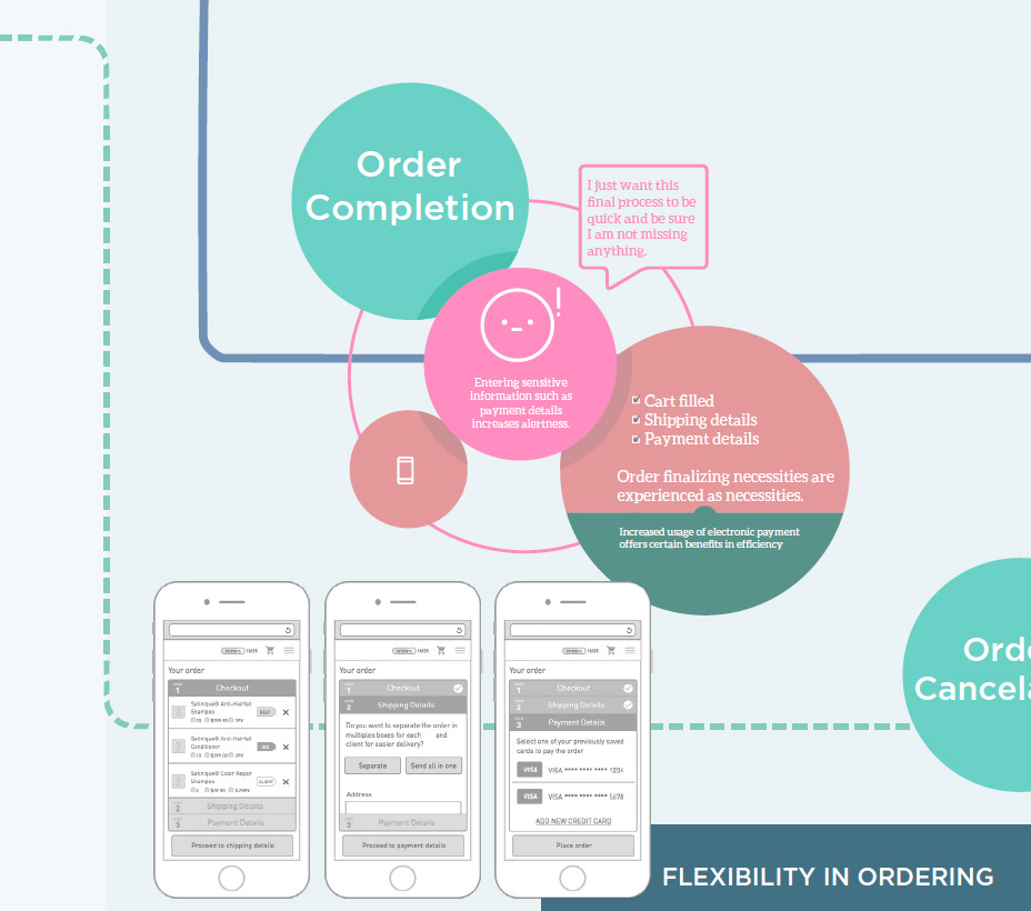
- 4) design of wireframes according to service blueprint


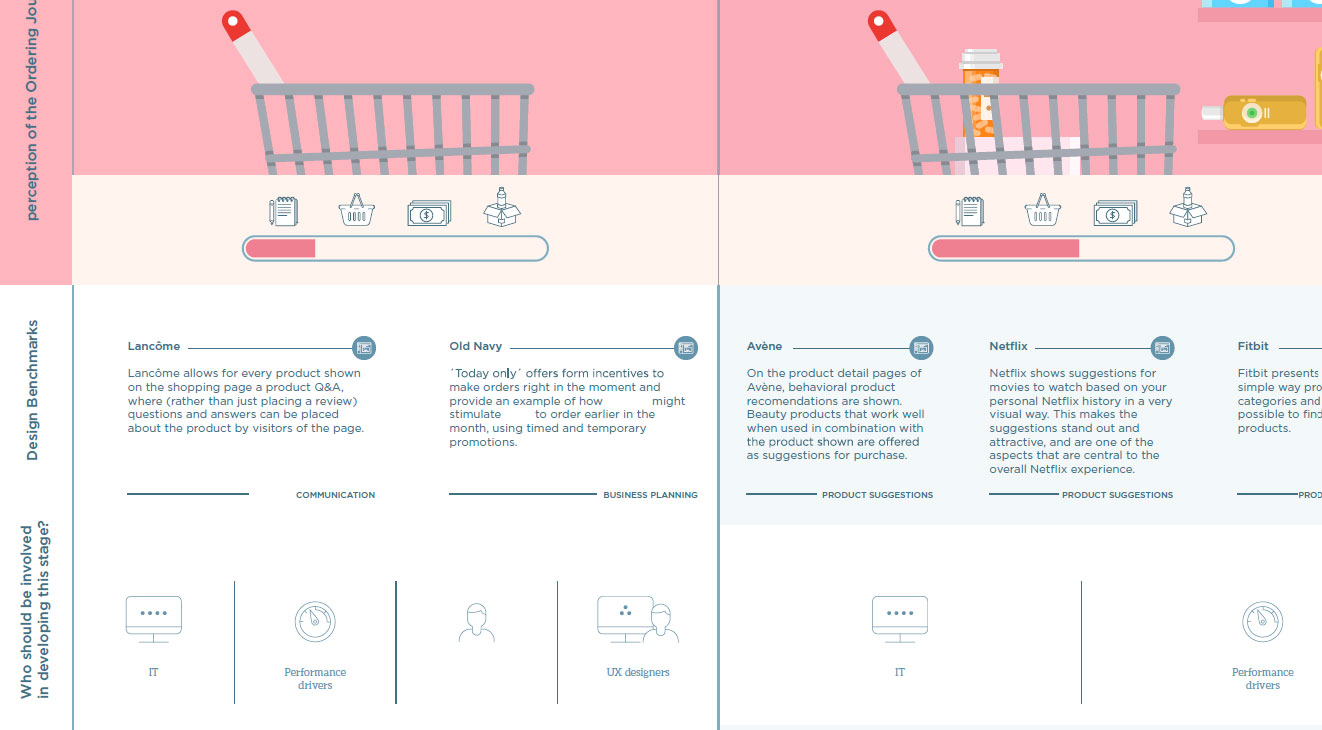
Some close up details of the ideal journey map
Solution and results
Firstly a thorough analysis of the service offering in the form of a customer journey mapping was delivered to the client, who before that had never done extensive qualitative research across different markets.
Secondly, a complete redesign of the customer’s experience when ordering products online from the client’s platform was presented, including wireframes that incorporated design suggestions to adapt each screen in the ordering process.
The combination of these deliverables formed a solid foundation for the client that helped shape their ecommerce strategy and formed the starting point of a redesign of their digital retail platforms.